City Cycles
Improving the Online Bike Rental Booking Experience
UX + SEO case study for a bike rental business in downtown Riverside, California.
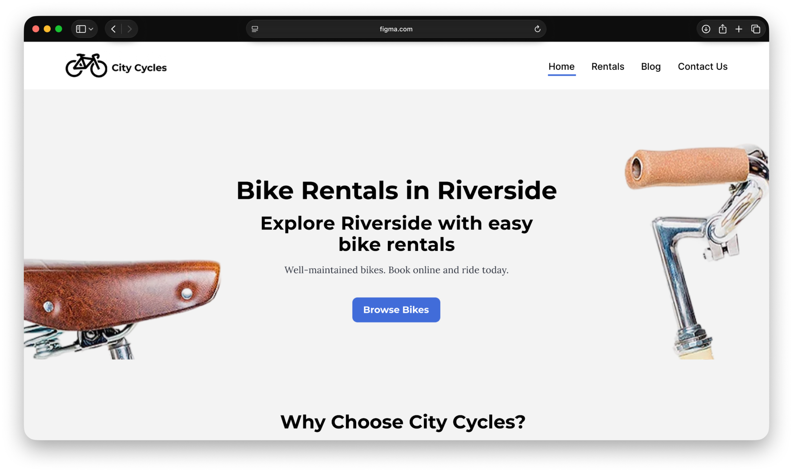
Project Overview
City Cycles is a bike rental business in downtown Riverside. The business wanted more customers to reserve bikes online instead of relying on phone calls, walk ins, or manual email requests.
Although the website appeared to offer online reservations, the booking experience was confusing and incomplete. My goal was to simplify the reservation process and create a clearer path from browsing available bikes to completing an online reservation.
This project allowed me to combine UX research, SEO strategy, and content organization to improve how users found information, navigated the website, and completed an online reservation. View the Prototype.
My Contributions
- UX Research
- Usability Analysis
- Reservation Flow Design
- Information Architecture
- SEO & Search Behavior Analysis
- High-Fidelity Prototyping
Project Goals
- Simplify the online reservation experience
- Make rental information easier to find
- Create a clearer booking path
- Reduce confusion during reservations
- Increase online reservations
Tools Used
- Figma
- Google Docs
- Google Search
- Squoosh
- Moz
The Problem: Users Were Ready to Book, But the Path Was Unclear
Most visitors arrived expecting a modern online booking experience. Instead, the reservation path became more confusing with each step. Users clicked a call-to-action, moved through multiple pages, reviewed rental details, and were ultimately directed to submit an email request instead of completing a reservation online.
This mattered because users were not leaving because they lost interest. They were leaving because they lost confidence in the reservation process.
Users still wanted to rent bikes, they simply needed a clearer and more trustworthy way to complete their reservation online.
Current Booking Journey
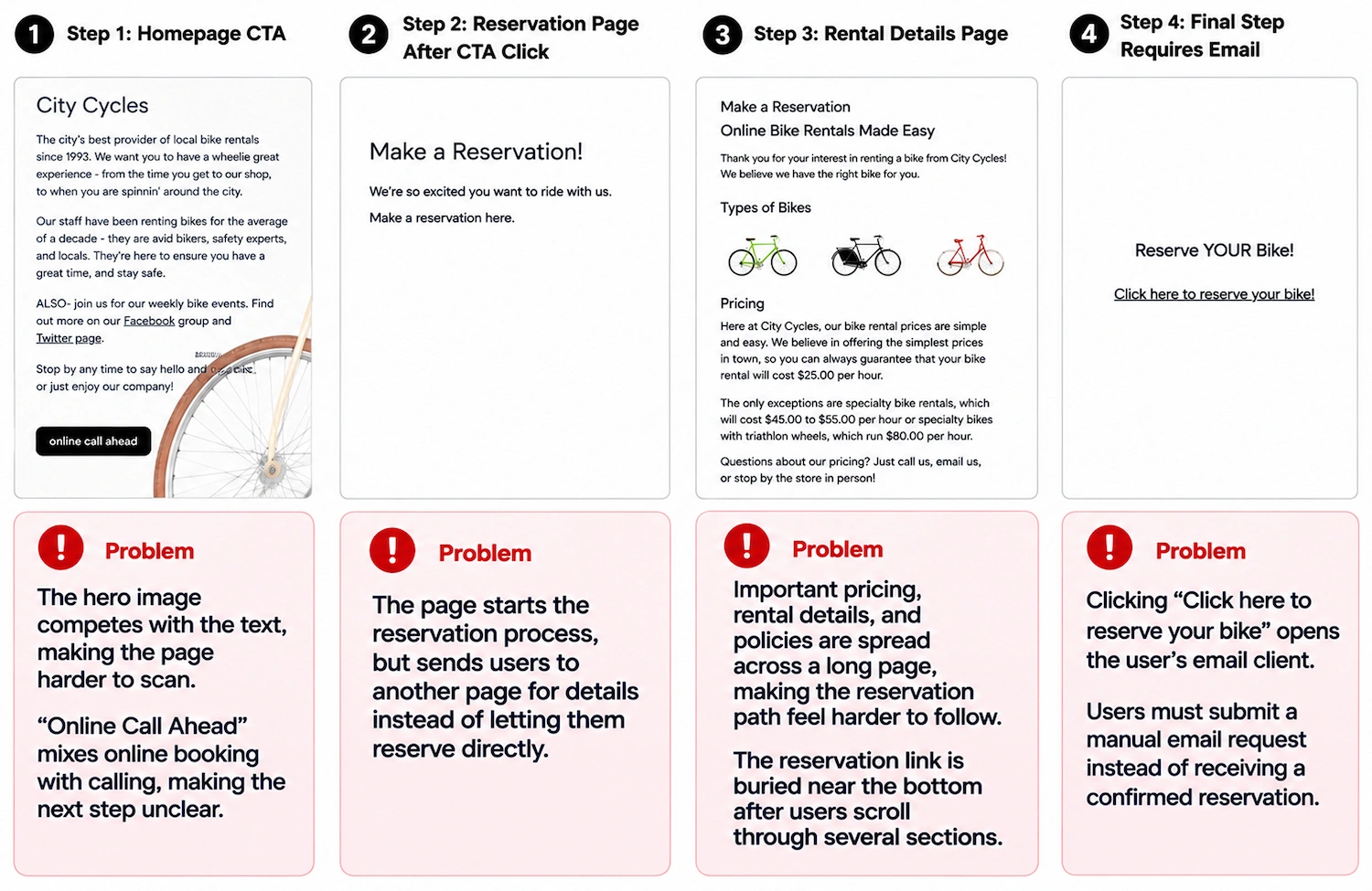
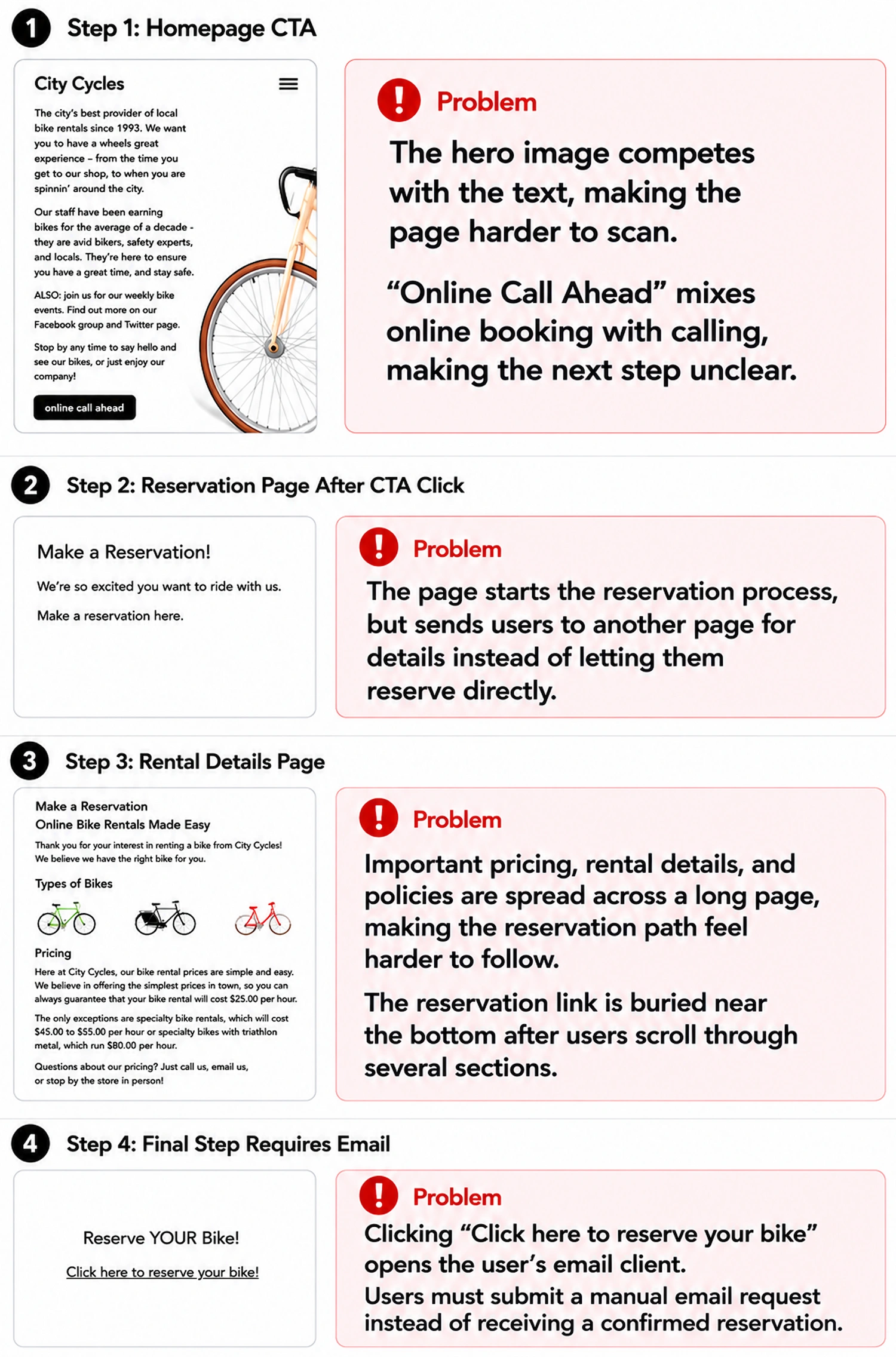
Key Takeaway: The original booking path created uncertainty because users could not complete or confirm a reservation directly on the website. Instead, the process ended with a manual email request, creating unnecessary friction for users who expected a modern online booking experience.
Research & Discovery: Understanding Where Users Lost Confidence
I began by reviewing the reservation experience from the user’s perspective. My goal was to understand what someone would expect when visiting the website ready to rent a bike and compare those expectations to the actual booking experience.
Through user personas, journey mapping, and usability analysis, I identified where users began to lose confidence and what prevented them from completing an online reservation.
User Persona
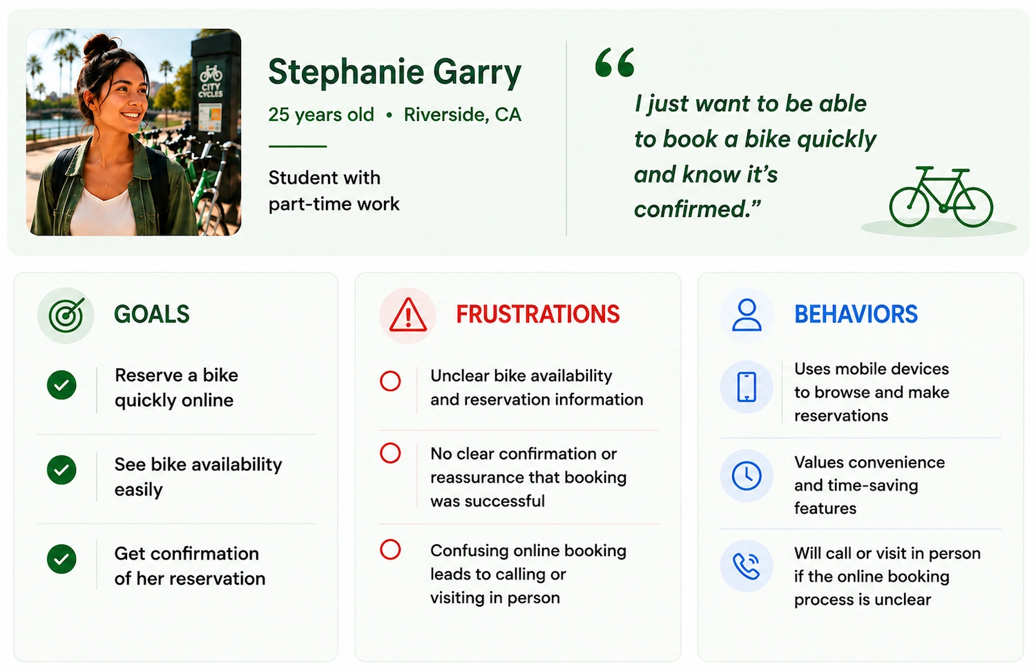
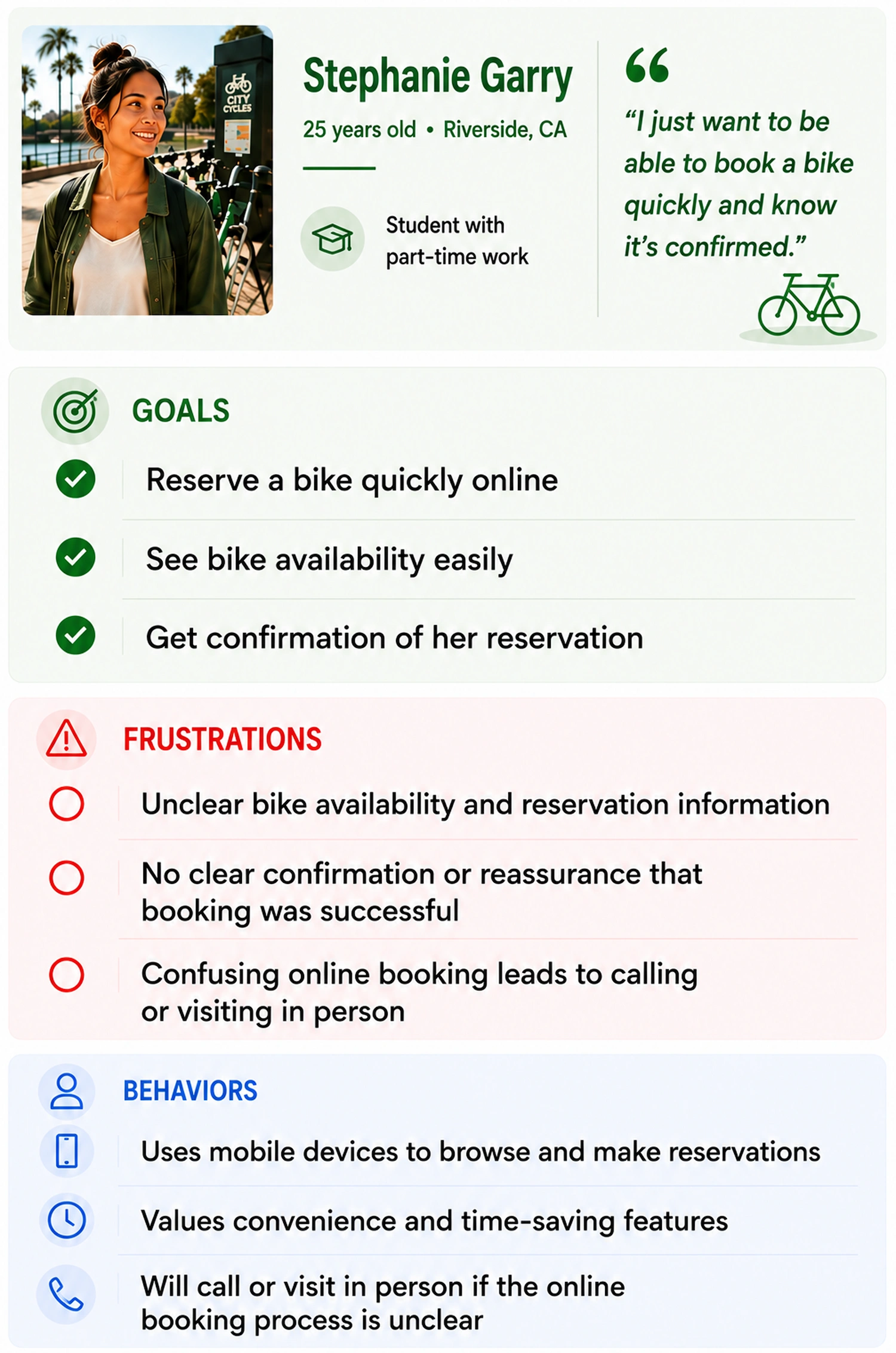
Key Takeaway: The user persona highlighted that visitors wanted a fast, clear, and reliable way to reserve a bike online. These insights helped shape a booking experience that reduced confusion and supported users throughout the reservation process.
Journey Mapping
Journey mapping helped visualize each step of the reservation process and identify where users became uncertain. While visitors started the experience motivated and ready to rent a bike, confidence declined as the booking path became more confusing and required additional steps
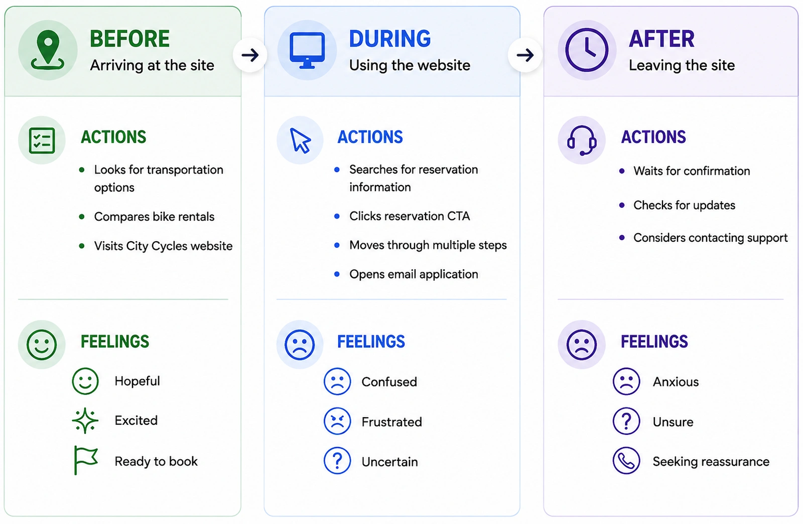
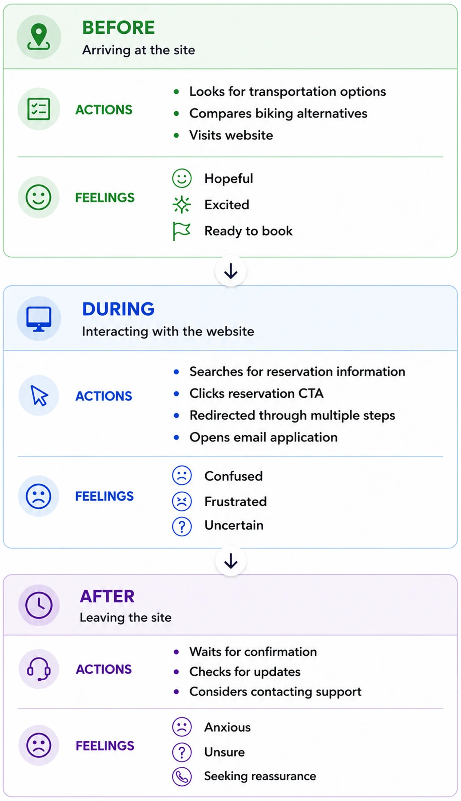
Key Takeaway: The journey map revealed where users became unsure, frustrated, and less confident during the booking process. These findings guided the redesign by identifying opportunities to simplify navigation, clarify the reservation flow, and reduce friction.
Research Findings: Analytics, User Feedback & Search Behavior
To better understand why users struggled with the reservation process, I reviewed analytics, user interviews, search behavior, and competitor websites. Together, these findings revealed where users lost confidence and what information they expected before making a reservation.
Analytics & User Feedback
- 85% of users left after clicking “Make a Reservation”
- Users described the reservation process as “frustrating” and “confusing“
- Heatmap data showed users frequently relied on the search bar and hesitated while using the navigation
- Only 25% of users scrolled to the bottom of longer pages, suggesting important reservation information was difficult to find
Search & Competitor Research
I also reviewed search intent, keyword opportunities, and competitor websites to better understand what users expected before renting a bike.
Research Focus
- Local keywords such as “bike rentals Riverside” and “Riverside bike rentals”
- Keyword volume and related search queries
- Competitor booking experiences
- Search intent behind bike rental searches
Key Findings
The research consistently pointed to the same problem:
- Users arrived with a clear intent to rent a bike
- They expected to quickly compare bike options, pricing, and availability
- Reservation details were difficult to find
- The booking path felt unclear and incomplete
- Navigation did not guide users efficiently toward renting a bike
- Competitor websites offered a simpler and more direct reservation experience
Key Takeaway: Research showed that the primary issue was not user interest, it was user confidence. Visitors wanted a straightforward way to compare bikes, review pricing, and complete a reservation, but the existing experience created uncertainty instead of supporting that goal.
Information Architecture: Making Rentals and Reservations Easier to Find
As I reviewed the site’s structure, I noticed that important rental and reservation information was buried behind multiple pages, unclear links, and disconnected navigation paths.
To reduce confusion, I reorganized the sitemap around the primary task users came to the site to complete: reserving a bike. Rentals and reservations became the primary focus, while supporting content was reorganized to create a clearer, more intuitive navigation experience.
The updated structure helped users:
- Find reservation information faster
- Understand where to go next
- Move through the booking process with less confusion
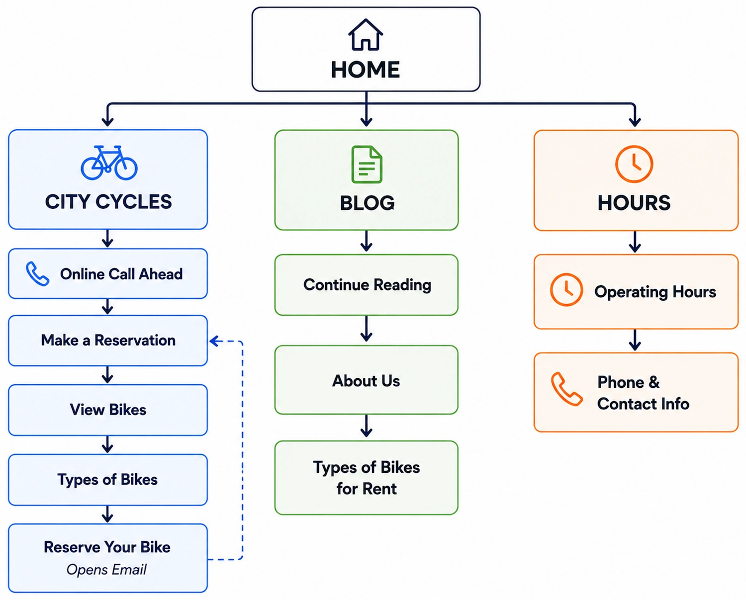
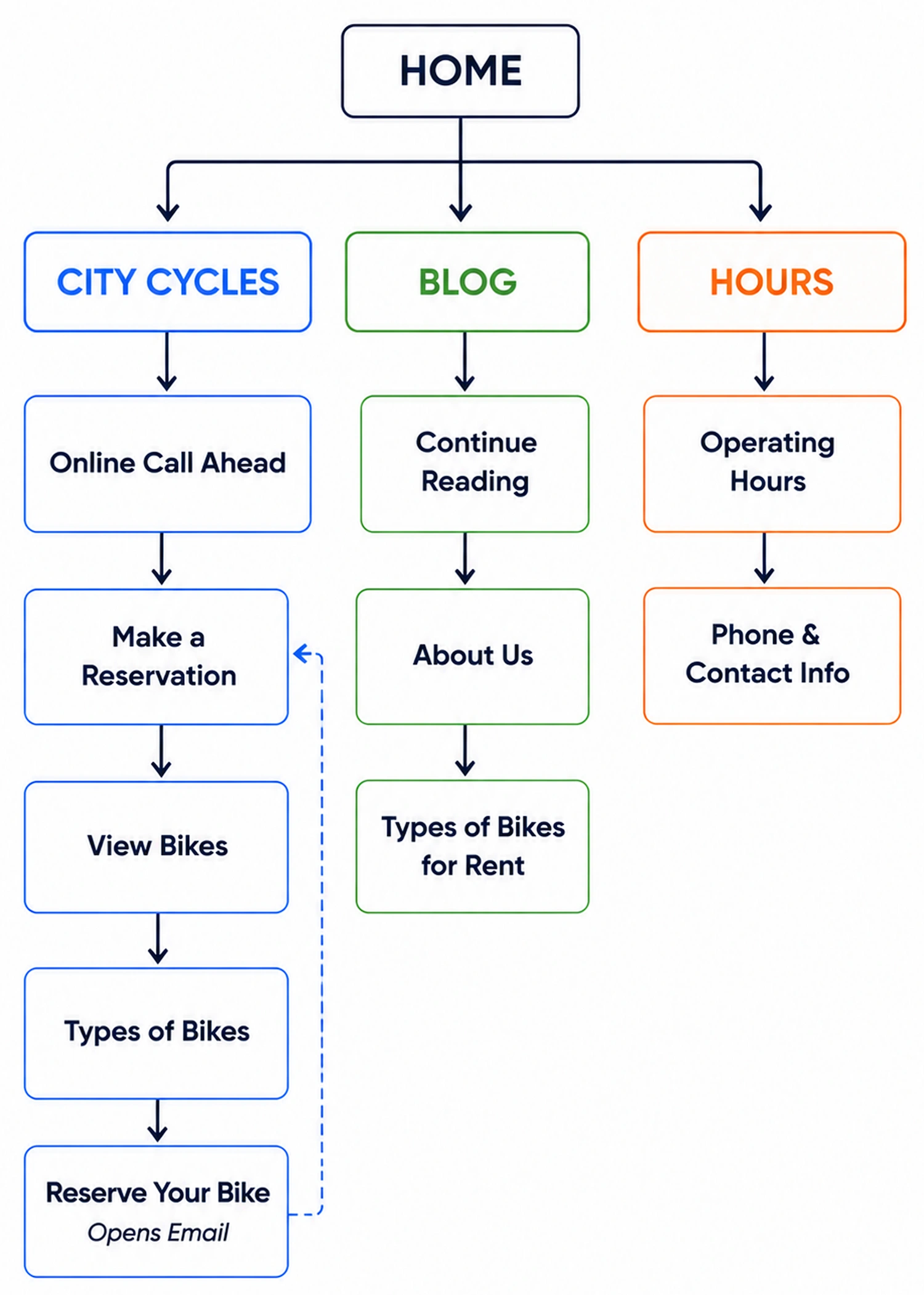
Existing Sitemap
The original sitemap buried rentals and reservations behind multiple pages and unclear navigation paths.
Redesigned Sitemap
The redesigned sitemap prioritized rentals and reservations, making the primary user journey easier to find and follow.
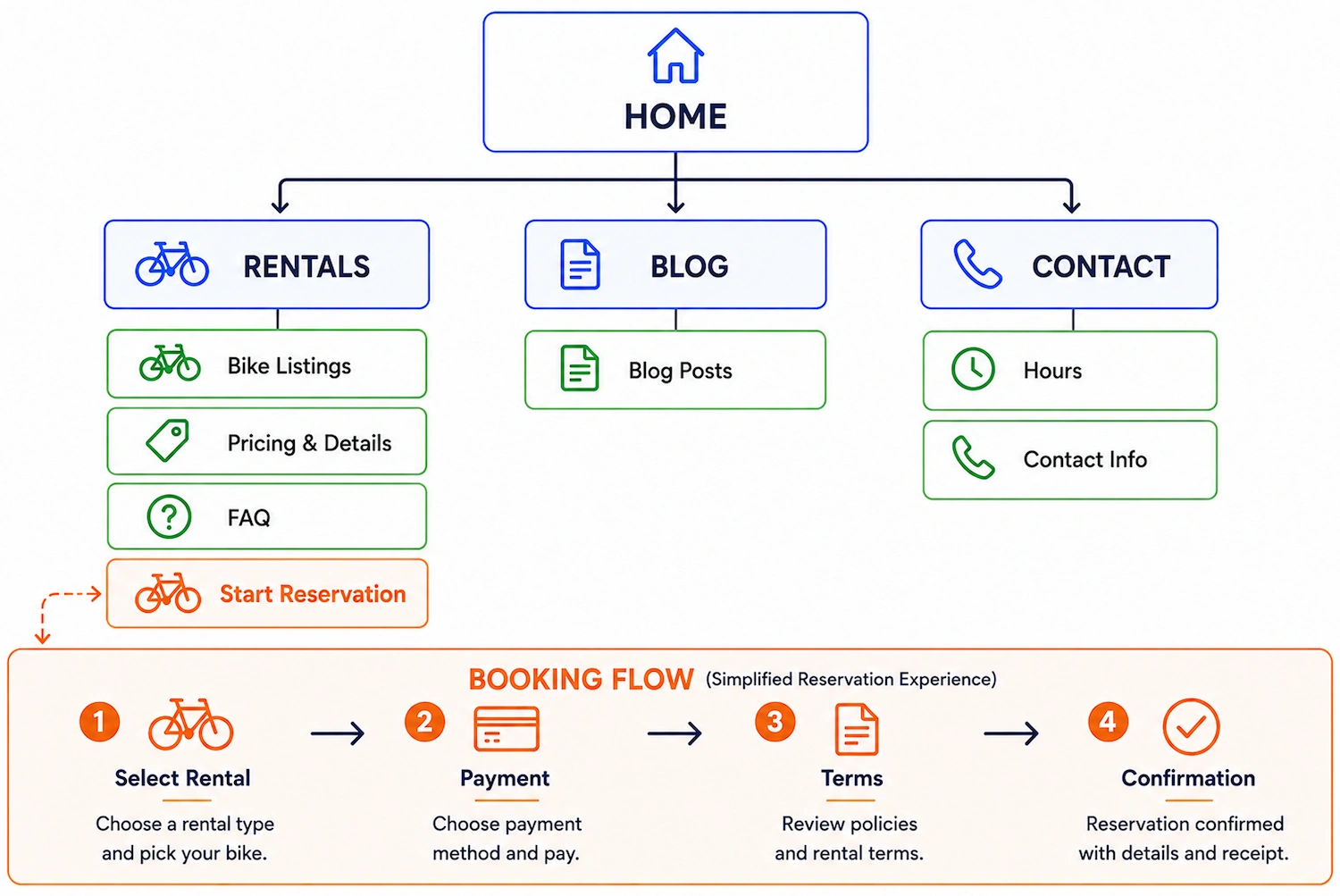
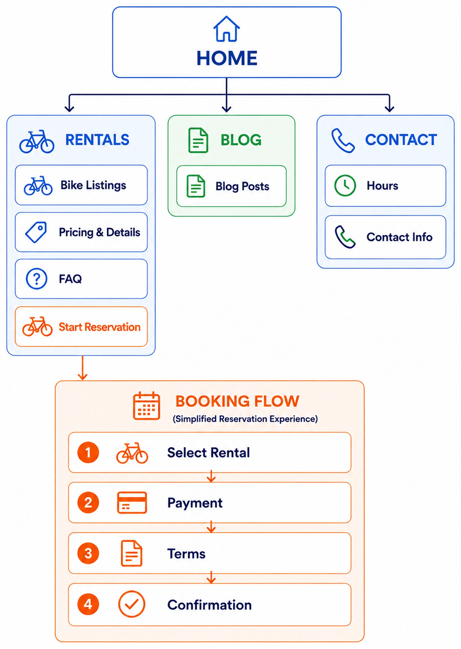
Key Takeaway: Comparing the two sitemaps showed how reorganizing the site’s structure made rentals, reservations, and supporting information easier to find, creating a clearer path toward completing a reservation.
Design Solution: A Clearer Path From Rentals to Reservation
The redesign focused on making bike rentals easier to find, easier to understand, and easier to reserve.
Before creating the high-fidelity prototype, I explored different layouts through paper sketches and digital wireframes to improve the page structure, call-to-action placement, and overall booking flow.
The final homepage guided visitors from learning about the service to confidently beginning the reservation process.
Homepage Redesign

Key Design Decisions
- Clear hero message: Introduced City Cycles with a simple headline focused on bike rentals in Riverside
- Primary CTA: Replaced the confusing “Online Call Ahead” button with a prominent Browse Bikes CTA
- Improved content hierarchy: Reduced distractions so users could immediately understand what the business offered and where to begin.
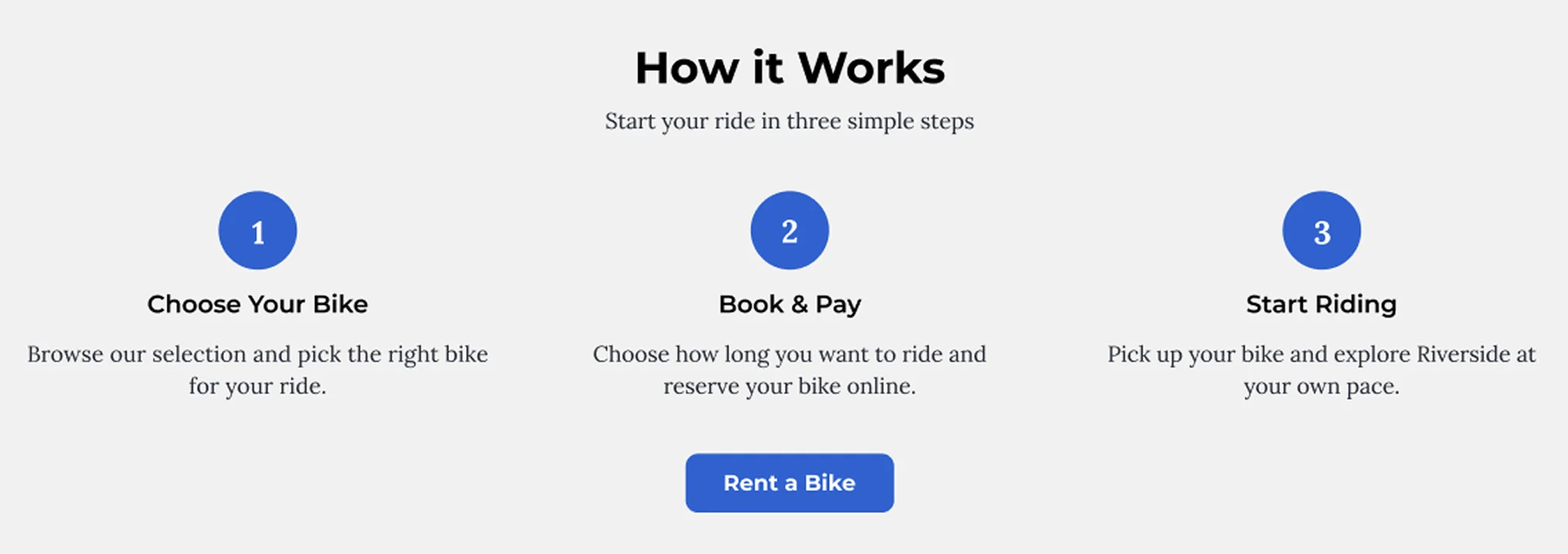
Simplified Booking Process
Key Design Decisions
- How It Works: Added a simple 3 step process explaining how to rent a bike
- Supporting CTA: Reinforced the booking journey with a Rent a Bike button placed directly below the process
- Trust building content: Organized supporting information to help visitors feel confident before beginning a reservation
Key Takeaway: The redesigned homepage gave users a clear starting point, explained the reservation process, and guided them toward booking with simple, well placed calls to action.
Rentals Page Redesign
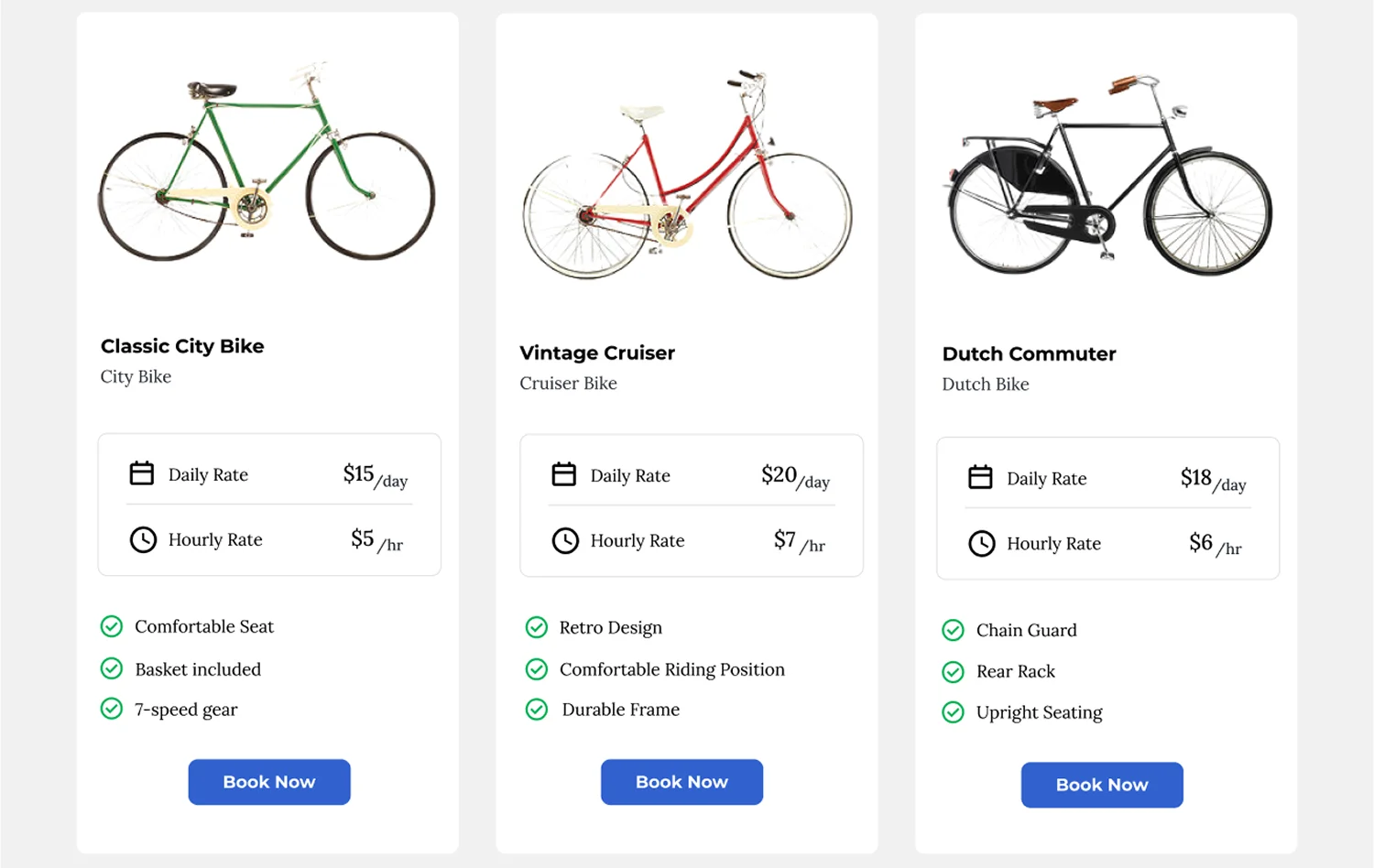
The redesigned Rentals page became the central place for users to compare bikes, review pricing, and begin a reservation without navigating through multiple pages.
Instead of hiding important information throughout the website, each bike card presents the details users need to make a decision in one location. Visitors can quickly compare bike types, pricing, features, and begin the booking process using a clear Book Now call to action.
To reduce uncertainty without adding visual clutter, I also included an FAQ accordion below the bike listings to answer common rental questions while keeping the page easy to scan.
Compare Bikes & Start Booking
Key Design Decisions
- Easy comparison: Displayed multiple bike options side by side for quick comparison
- Transparent pricing: Included both hourly and daily rates directly on each bike card
- Feature highlights: Added key bike features to help users choose the option that best fit their needs
- Book Now CTA: Placed a clear Book Now button on every card so visitors could begin the reservation process immediately
- Reduced friction: Combined pricing, bike details, and the booking action into one location, eliminating unnecessary navigation
Key Takeaway: The redesigned Rentals page allowed users to compare bikes, review pricing, and start a reservation from one page, creating a faster and more confident booking experience.
Booking Flow Improvements
The redesigned booking flow guided users through each step of the reservation process with a clear, structured experience. After selecting a bike, users could review their rental, choose a rental duration, enter their information, select a payment method, and confidently complete their reservation.
Key Design Decisions
- Guided reservation flow: Broke the booking process into clear, manageable steps from bike selection to confirmation
- Transparent booking details: Displayed pricing, rental dates, and payment information before confirmation
- Terms and conditions: Included rental policies before checkout to help users make informed decisions
- Confirmation experience: Designed a confirmation page with reservation details and pickup information to reassure users that their booking was complete
Key Takeaway: The redesigned booking flow guided users from bike selection to reservation confirmation with a clear, step-by-step process that reduced uncertainty and increased confidence.
SEO Improvements
Because many visitors were likely searching for local bike rentals before arriving on the website, I also considered how the redesigned pages could better support both search intent and the user experience.
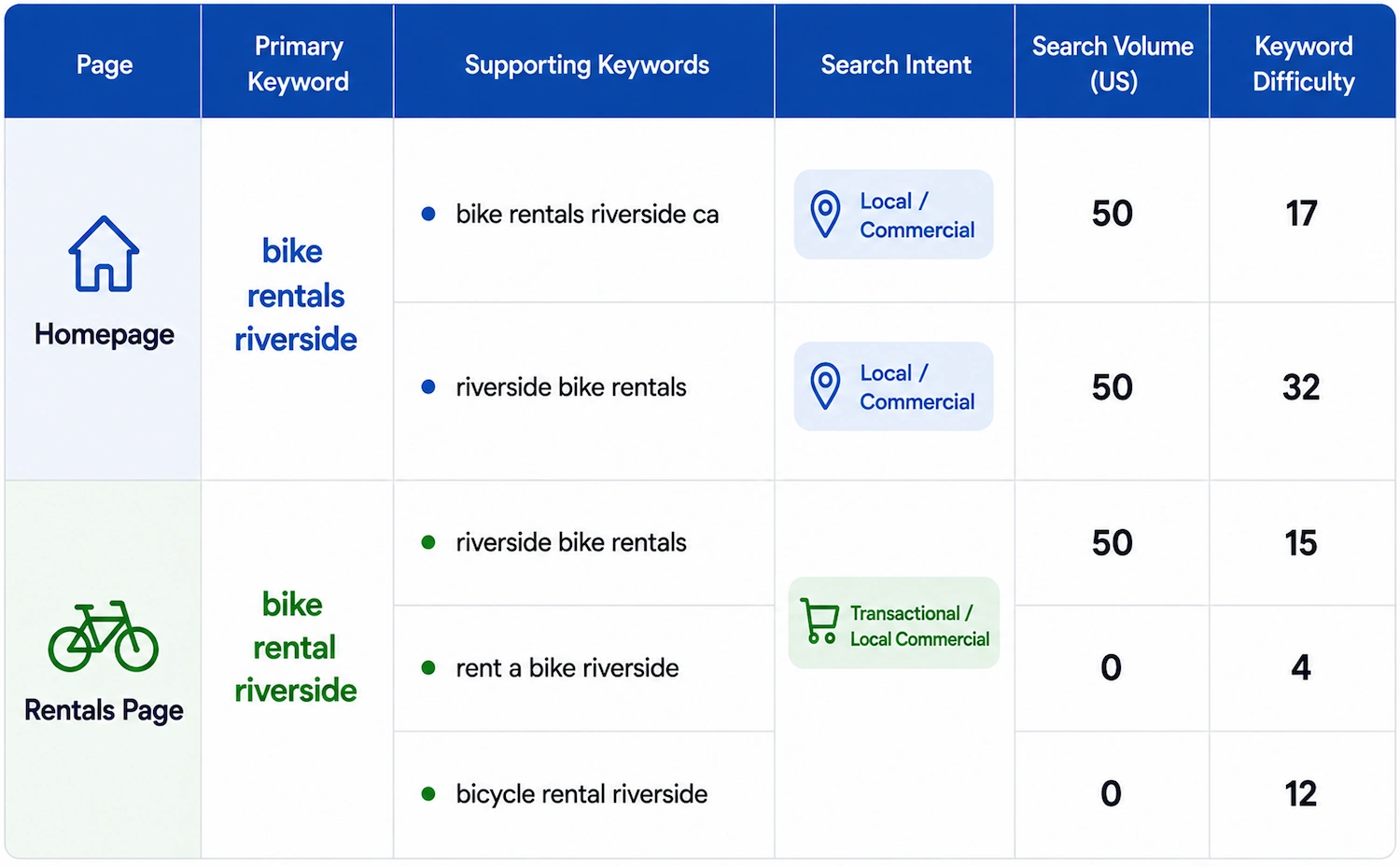
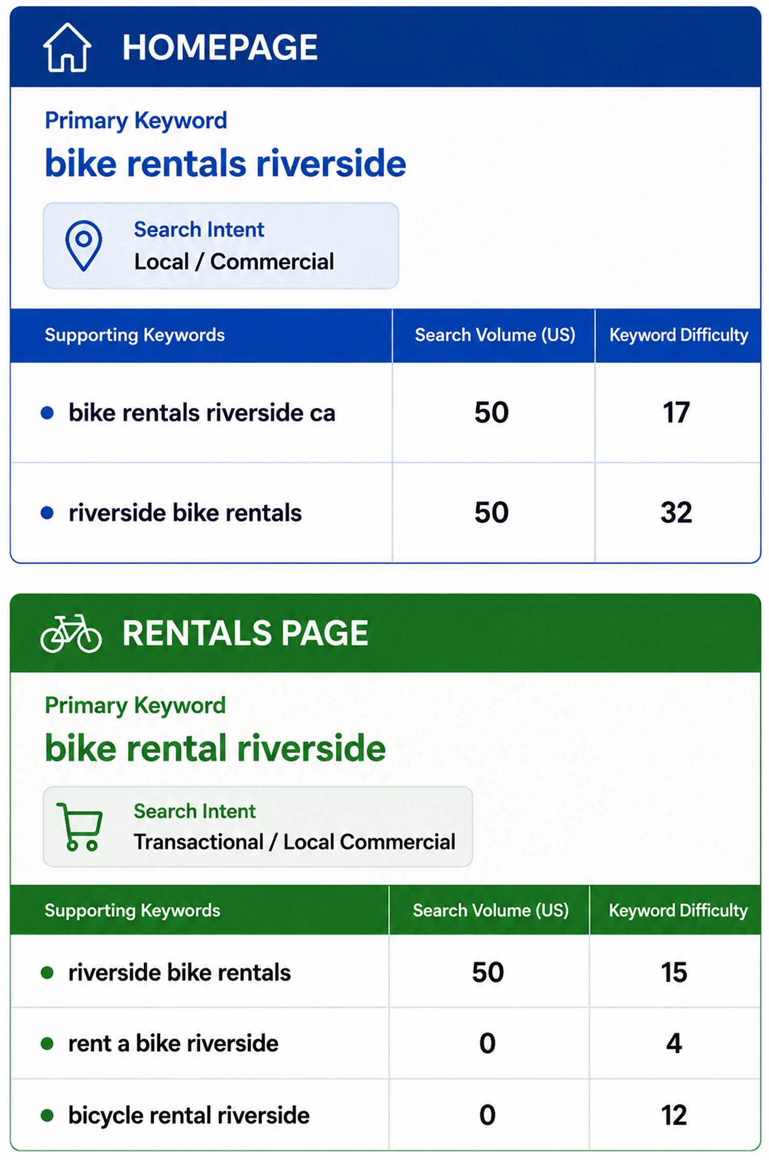
I researched local bike rental keywords, reviewed competitor pages, and analyzed search intent to understand what users expected to find before making a reservation.
Local Keyword Research
Key Findings
- Users searched for local bike rental terms with clear intent to rent a bike
- Search intent showed that visitors wanted pricing, bike options, and a straightforward way to begin a reservation
- Competitor pages made rental information easier to find and emphasized clear booking calls to action.
SEO Improvements
- Clearer rental focused headings to match local search intent
- Content aligned with user expectations before booking
- Improved access to bike options, pricing, and reservation information
- Stronger page structure to support both navigation and search visibility
Key Takeaway: Keyword research helped align the redesigned pages with what users were already searching for: local bike rentals, pricing, and booking information. The result was a structure that supported both the user experience and future SEO efforts.
How I Would Measure Success
If this redesign were implemented for a real client, I would measure whether users could move from interest to reservation with less confusion.
UX Metrics
- Reservation button clicks
- Booking form starts
- Completed reservations
- Drop off points throughout the booking flow
- Reduction in phone calls or email reservation requests
SEO Metrics
- Organic traffic to the Rentals page
- Impressions, clicks, and rankings for local bike rental keywords
- Engagement with rental pages
- Reservations originating from organic search
Together, these metrics would help determine whether the redesign improved both discoverability and the online booking experience.
Reflection & Lessons Learned
This project reinforced how important clarity is when users are completing a task online. City Cycles didn’t simply need a more modern website, it needed a reservation experience that helped users understand what to do next and feel confident throughout the booking process.
One of the biggest challenges was balancing UX and SEO. I wanted the redesigned pages to be easier to discover through search while keeping the content natural, helpful, and focused on the user’s needs.
The most valuable lesson I learned was that improving the user experience is not always about adding more features. Sometimes the better solution is simplifying the experience, removing uncertainty, and guiding users through one clear step at a time.
Final Takeaway: Designing City Cycles showed me how UX research, information architecture, and SEO strategy work together to solve real usability problems. By simplifying the reservation process and aligning the website with user expectations, I created a more intuitive experience that supported both users and the business. View the Prototype.
Explore More Work
PREVIOUS PROJECT
BACK TO FEATURED WORK