Sylvia’s Sweets
Turning a Broad Dessert Business Into a Focused Cookie Subscription Experience
How a broad dessert concept became a focused cookie subscription experience through UX strategy, SEO research, and coordinated landing page and email design.
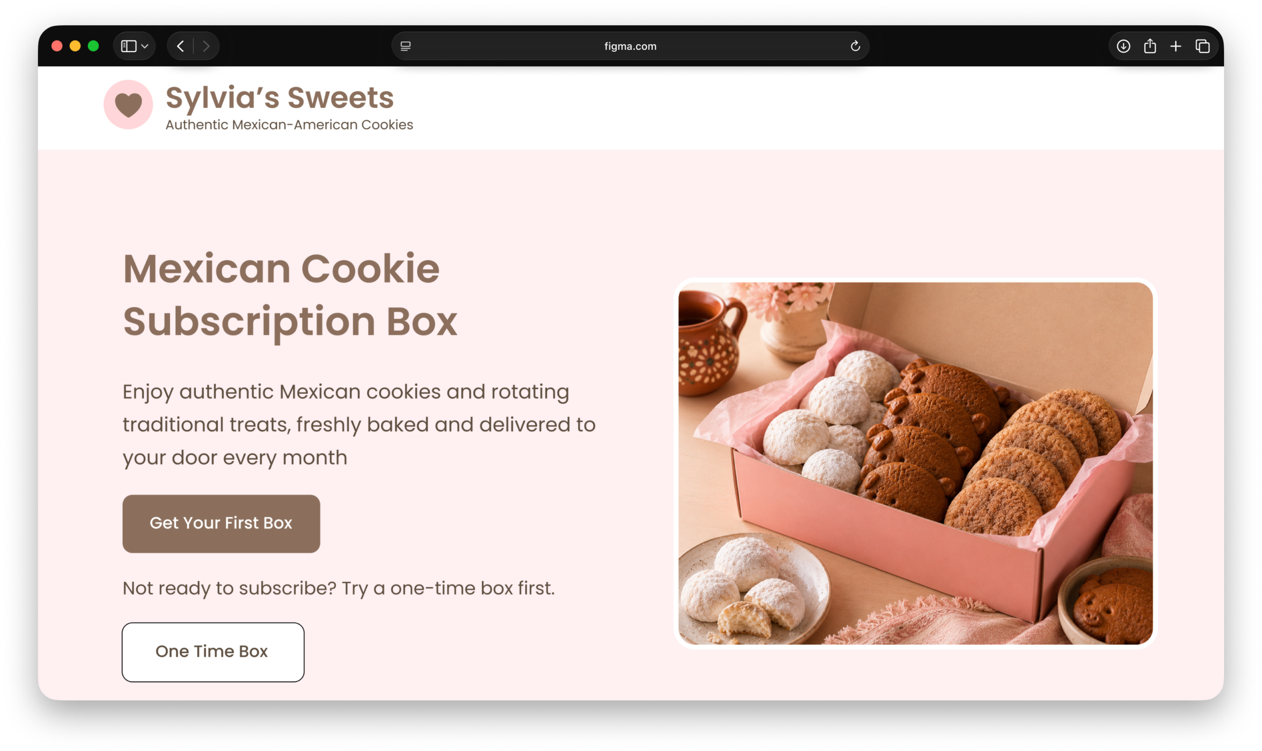
Project Overview
Sylvia’s Sweets is a Mexican-American cookie business built around a monthly cookie subscription inspired by Sylvia’s family traditions.
Sylvia already had loyal customers and strong word-of-mouth referrals, but the business struggled to attract new customers beyond her existing network.
This project focused on designing a conversion focused landing page and promotional email campaign that introduced the monthly cookie subscription, built trust with first time visitors, and encouraged more customers to place their first order.
Using UX research, SEO and search intent research, competitor analysis, messaging strategy, and high-fidelity design in Figma, I redesigned the experience to create a customer journey that felt warm, clear, and easy to navigate. View the Prototype.
My Contributions
- UX Research
- SEO & Search Intent Research
- Competitor Analysis
- Landing Page Strategy
- CTA & Offer Positioning
- Email Campaign Design
- High-Fidelity UI Design
Project Goals
- Introduce Sylvia’s monthly cookie subscription
- Increase first-time purchases
- Strengthen the email-to-landing-page journey
- Create a warm, clear, and trustworthy customer experience
- Support both monthly subscriptions and one time purchases
- Use SEO and search intent to shape messaging
Tools Used
- Figma
- Mailchimp
- SEMrush
- Moz
- Google Search
The Problem: Sylvia Had Loyal Customers, But Limited Reach
Sylvia’s Sweets had loyal customers, but most sales came through word-of-mouth referrals. While this demonstrated strong customer satisfaction, it also limited the business’s ability to reach new customers.
Sylvia also maintained an email list of approximately 150 subscribers, but technical issues made email marketing difficult to manage consistently.
Without a dedicated landing page, Sylvia had no clear way to explain the monthly cookie subscription, build trust with first time visitors, or support future email campaigns.
The Main Problems
- Heavy reliance on word-of-mouth referrals limited business growth
- Email marketing was difficult to manage consistently
- Limited visibility made it harder to reach new customers
- There was no dedicated landing page to explain the monthly cookie subscription
- The site lacked clear messaging for both monthly subscriptions and one time purchases
- First-time visitors needed more trust and confidence before making a purchase
Research & Discovery: Understanding Sylvia’s Customers
I began by reviewing Sylvia’s existing marketing efforts and learning more about the customers she was already reaching.
Sylvia’s primary customers were women who valued convenience, affordability, and homemade cookies that felt personal and nostalgic.
As I reviewed the audience alongside search intent research, I realized that broad dessert messaging created mixed expectations. Shifting the focus toward Mexican cookies made the offer more specific, aligned with what customers were searching for, and easier to understand.
What I Learned About the Audience
- The primary audience was mostly ages 18–35 and preferred monthly delivery
- Many customers connected the cookies with home, comfort, and family tradition
- A smaller audience included Mexican-American women ages 35–55 who preferred one time purchases
- 75% of buyers were women
- About 50% of sales came from word-of-mouth referrals through Sylvia’s daughter and her daughter’s friends
These insights helped shape a landing page that balanced emotional storytelling with practical information like pricing, delivery, and subscription options.
Buyer Personas
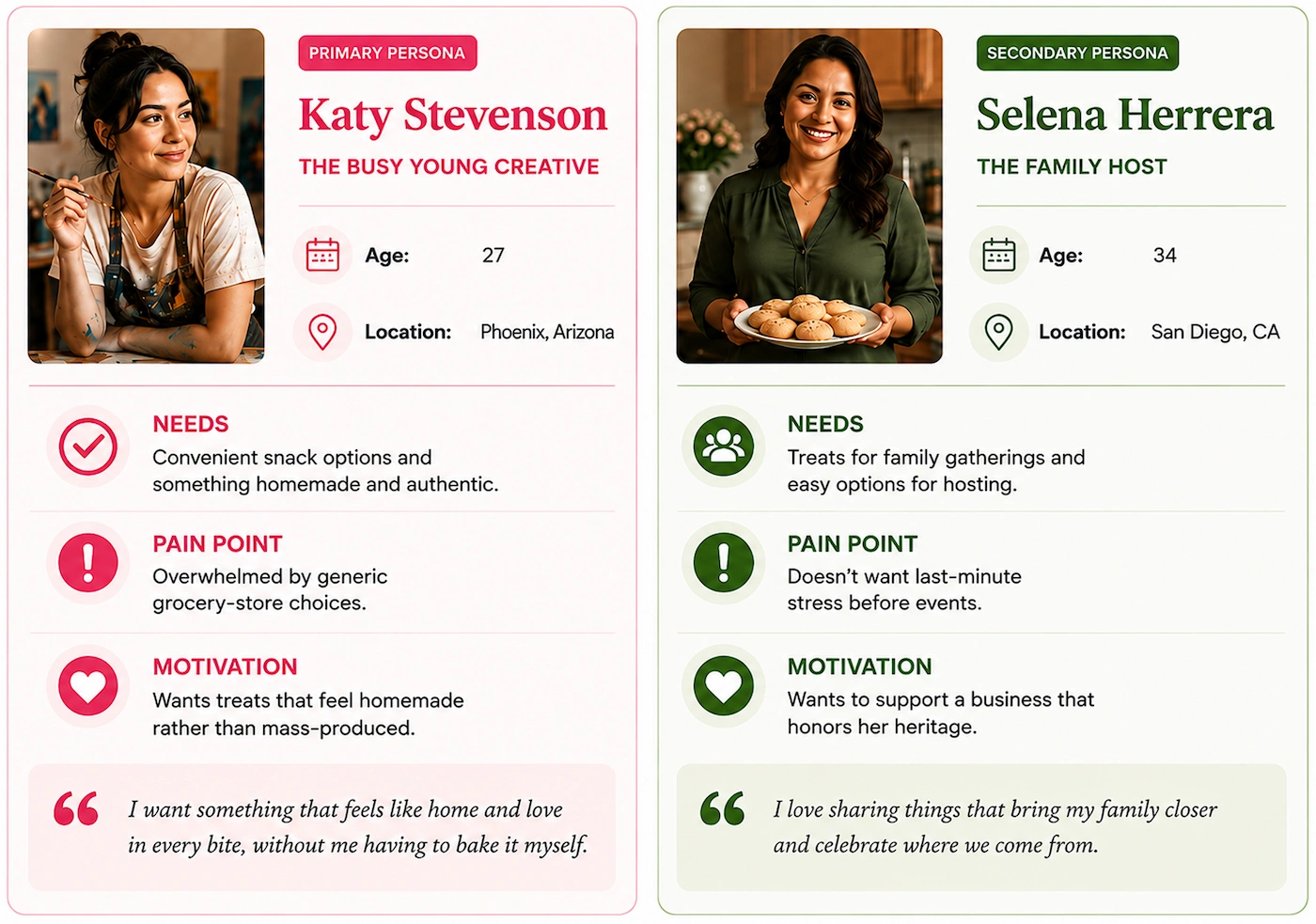
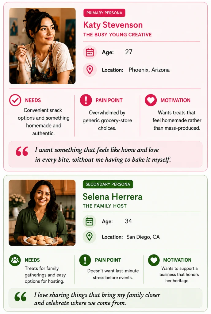
Key Takeaway: Research showed that Sylvia’s customers valued convenience, affordability, and homemade cookies rooted in family tradition. These insights helped shape a landing page that balanced emotional storytelling with clear information about pricing, delivery, and subscription options.
Search Intent & Competitive Research
I reviewed search intent and competitor examples to better understand how people might search for a monthly cookie subscription online.
After analyzing the search results, I found that broad terms like “Mexican desserts” and “Mexican sweets” were too general. The results included candy, recipes, local bakeries, major brands, and other dessert related content, making it difficult to communicate Sylvia’s unique subscription offer.
This research showed that focusing on a Mexican cookie subscription created a clearer message that better matched user expectations and made the offer easier for first time visitors to understand.
Research Focus
- Search terms related to Mexican sweets, Mexican desserts, and cookie subscriptions
- Keyword research for primary and supporting keywords
- Competitor analysis, including Graze and Universal Yums
- Search intent behind subscription, gift box, and cookie related searches
- Future SEO opportunities for Sylvia’s website.
How Search Intent Guided the Landing Page Strategy
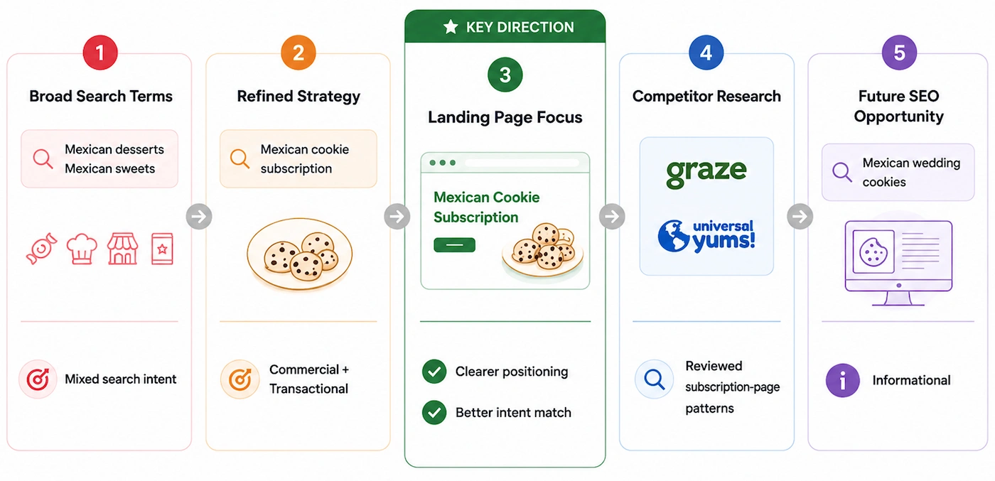
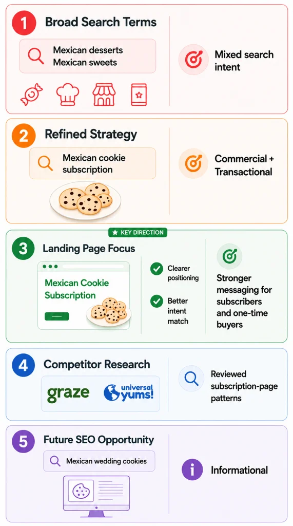
Key Takeaway: Broad search terms attracted mixed search intent, making the offer feel less specific. Focusing the messaging on a Mexican cookie subscription created a clearer value proposition while uncovering future SEO opportunities around Mexican wedding cookies.
Design Solution: Landing Page + Email Campaign
The original Mailchimp concept introduced Sylvia’s business through a landing page and promotional email. After completing UX research, search intent research, and competitor analysis, I identified opportunities to better align the messaging with what potential customers were actually searching for.
Rather than using broad dessert messaging, I redesigned the experience around a Mexican cookie subscription with clearer messaging, stronger calls to action, and a more focused customer journey.
I also expanded the original landing page concept into a scalable experience that could serve as the foundation for a future website, making it easier to support additional content, future SEO opportunities, and continued business growth.
Together, the redesigned landing page and email campaign created a more consistent customer journey that introduced the subscription, built trust with first time visitors, and encouraged customers to take action.
Final Landing Page
The redesigned landing page was created to help first time visitors quickly understand the monthly cookie subscription, build trust in Sylvia’s story, and confidently choose between a monthly subscription or a one time purchase.
Rather than overwhelming visitors with information, each section was intentionally organized to answer common questions, reduce uncertainty, and gradually guide customers toward a purchase decision.
Top of the Landing Page
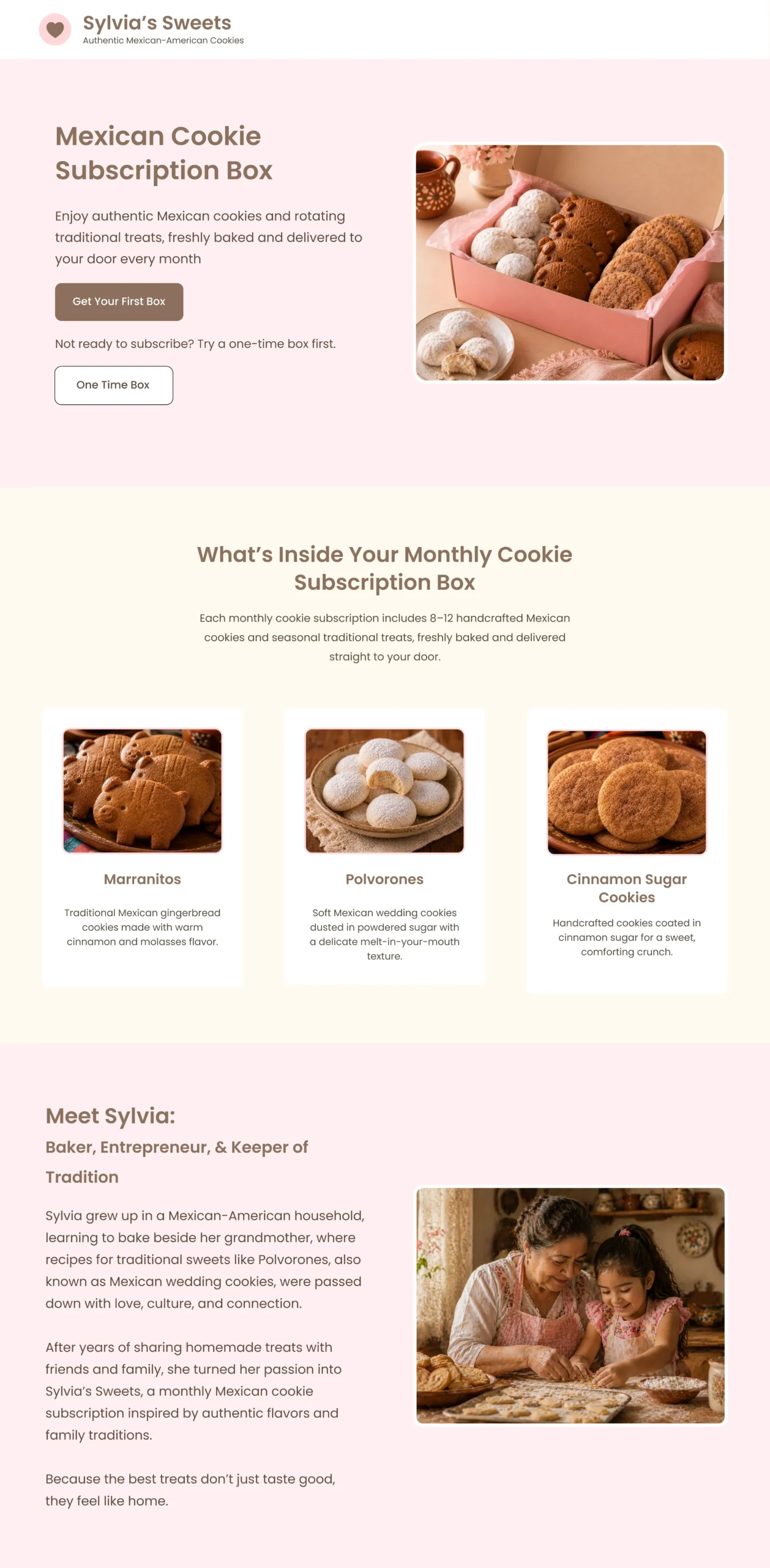
Key Design Decisions
The top section of the landing page introduced the subscription, explained the product, and established trust before asking visitors to make a purchase.
- Hero Section: Introduced the monthly cookie subscription with two clear calls to action, allowing visitors to choose between a monthly subscription or a one time purchase
- What’s Inside the Box: Added product previews and descriptions to clearly communicate what customers would receive in each monthly delivery
- Meet Sylvia: Shared Sylvia’s story to build trust, reinforce the family inspired brand, and create a personal connection with first time visitors.
Middle of the Landing Page
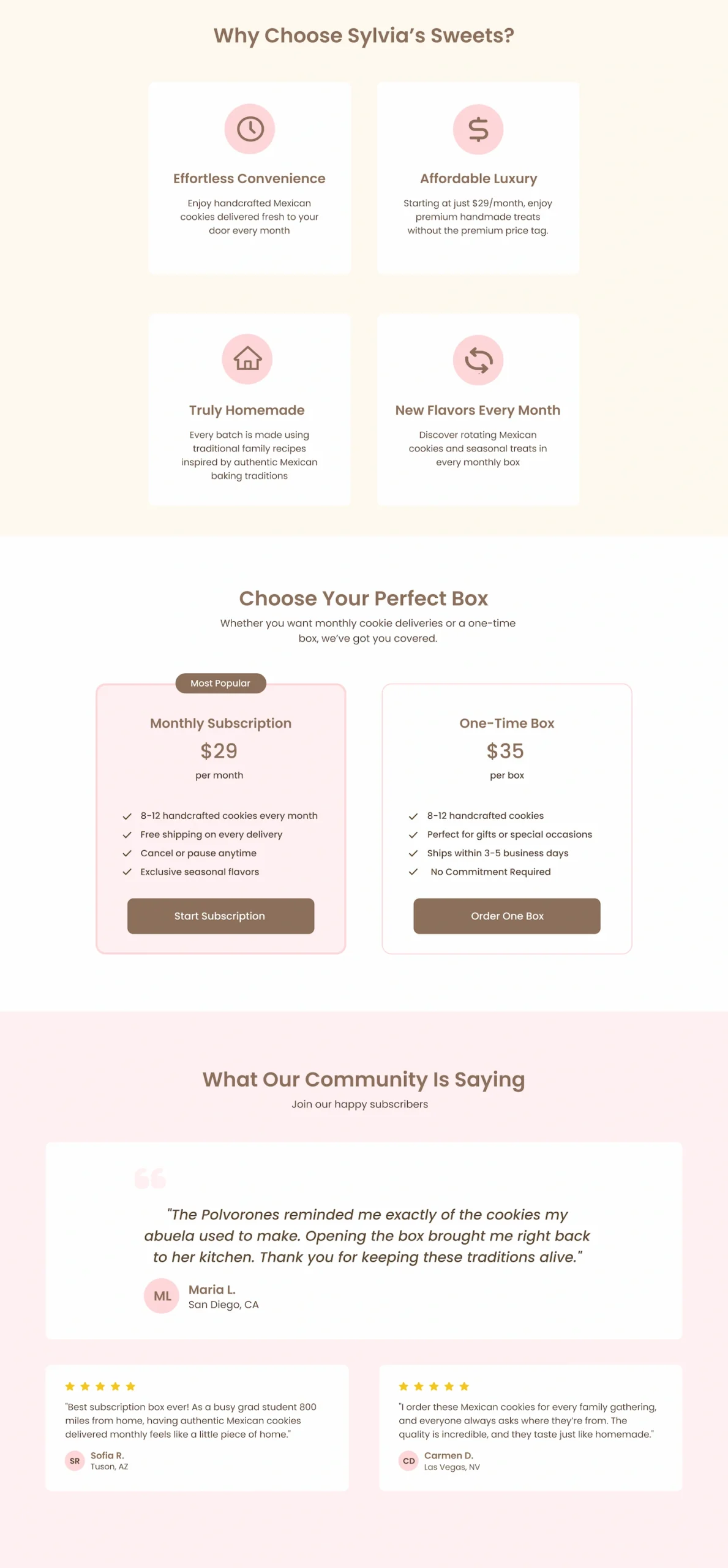
Key Design Decisions
The middle section focused on reinforcing the value of the subscription, helping visitors compare their options, and building confidence before asking them to make a purchase.
- Why Choose Sylvia’s Sweets: Highlighted the key benefits of the subscription to communicate what made the business unique
- Choose Your Perfect Box: Added clear pricing and purchase options for both monthly subscriptions and one time purchases, making it easier for visitors to compare their choices
- What Our Community is Saying: Included customer testimonials to provide social proof, reinforce trust, and reduce uncertainty for first time visitors.
Bottom of the Landing Page
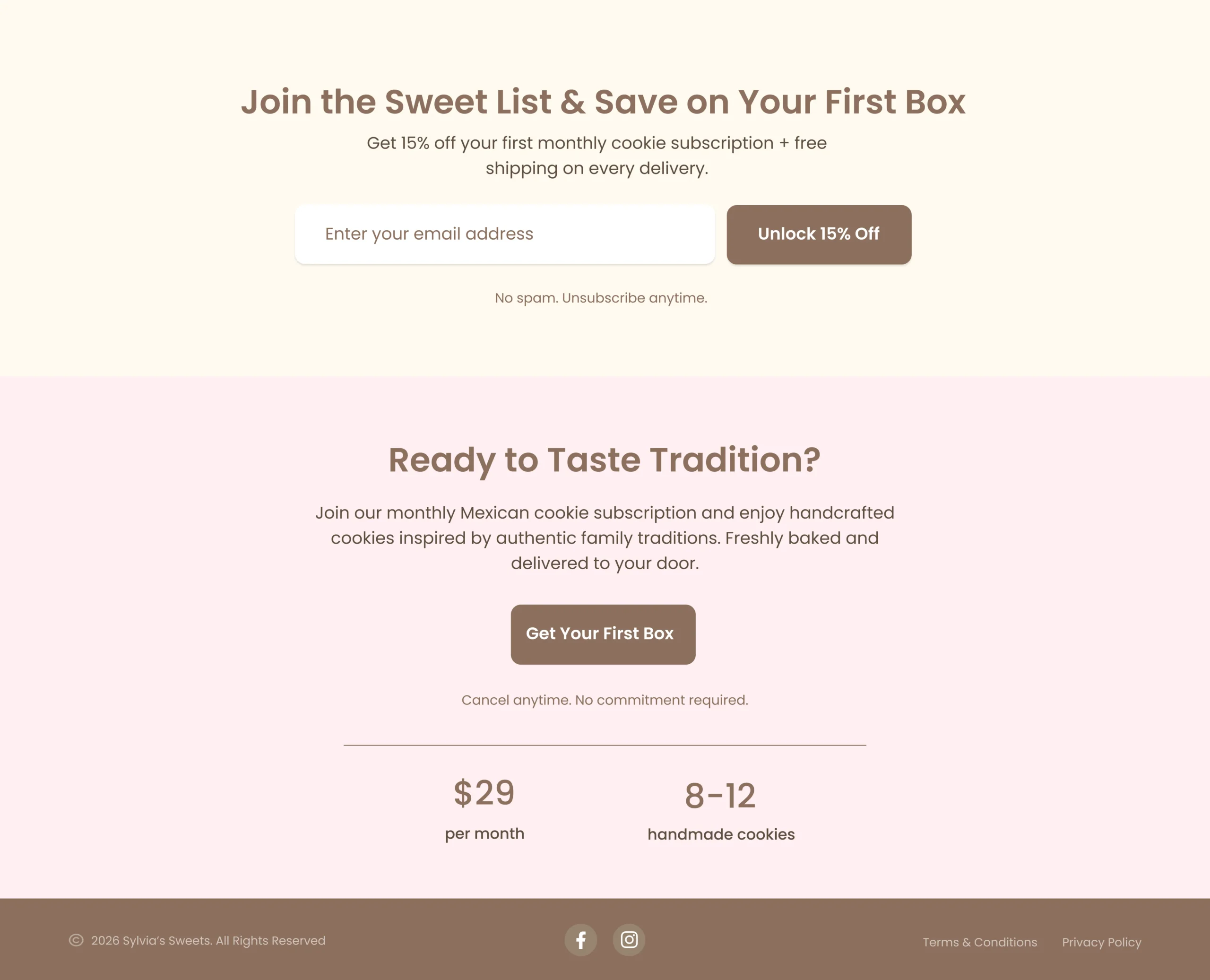
Key Design Decisions
The final section focused on capturing leads and encouraging visitors to take action after they had learned about the subscription and built confidence in the brand.
- Join the Sweet List: Added a 15% discount offer to encourage visitors to join Sylvia’s email list and support future email marketing
- Final Call to Action: Reinforced the subscription offer with a clear call to action, giving visitors one final opportunity to subscribe after reviewing the product, pricing, and customer experience
Key Takeaway: The redesigned landing page combined clear product messaging, trust-building content, and multiple purchase paths to create a more focused experience for first-time visitors. Each section was intentionally designed to answer customer questions, build confidence, and guide visitors toward either a monthly subscription or a one-time purchase.
Email Campaign
The promotional email was redesigned to support the updated landing page and create a consistent experience from email to website.
Rather than promoting Sylvia’s products with broader dessert messaging, the redesigned email reinforced the Mexican cookie subscription, highlighted the first time buyer offer, and matched the messaging, visual style, and branding introduced on the landing page.
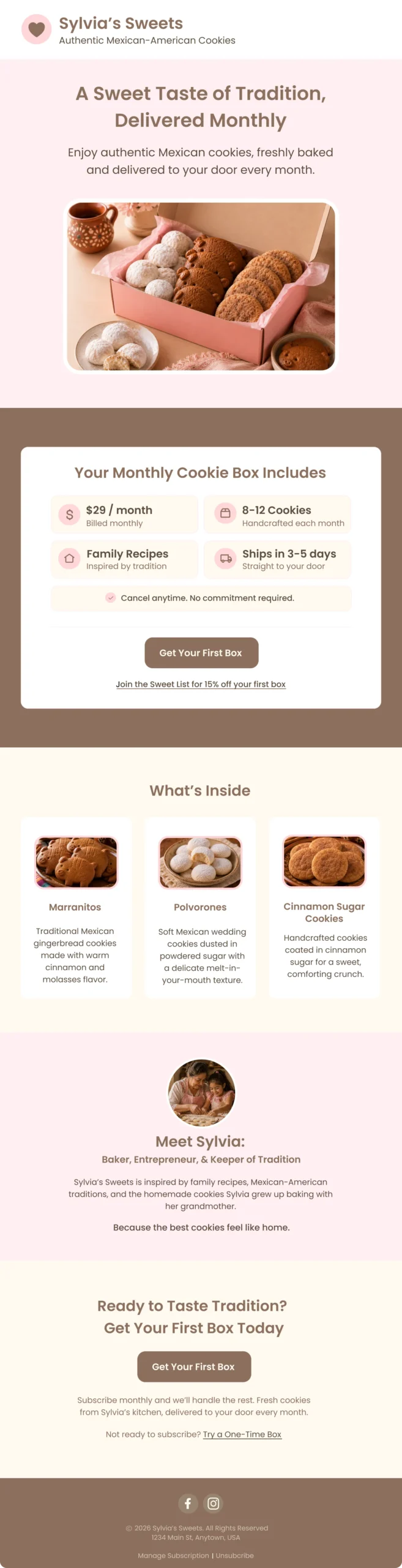
Key Design Decisions
The email was designed to reinforce the subscription offer and encourage visitors to continue to the landing page.
- Consistent messaging: Updated the copy to focus on the Mexican cookie subscription instead of broader dessert messaging
- Visual consistency: Matched the colors, typography, imagery, and branding used throughout the landing page
- Clear offer details: Highlighted the first time discount, subscription benefits, and product previews to help visitors quickly understand the offer
- Stronger call to action: Reinforced the subscription with a clear CTA that encouraged users to continue to the landing page
Key Takeaway: The redesigned email aligned the messaging, visual design, and calls to action with the landing page, creating a more consistent customer journey from email to website.
How I Would Measure Success
If this landing page and email campaign were implemented, I would measure whether they helped visitors understand the subscription, engage with the content, and ultimately become customers.
Metrics I Would Track
- Landing page visits to measure overall traffic
- Email open and click through rates to evaluate campaign engagement
- Primary CTA clicks to understand how many visitors showed purchase intent
- Monthly subscription purchases to measure conversions
- Organic traffic from cookie related searches to evaluate long term SEO performance
These metrics would help determine whether visitors were finding the page, understanding the offer, and progressing toward a purchase.
Future Improvements
- Test different CTA messaging, button placement, and promotional offers
- Create a welcome email sequence for new subscribers
- Expand the website with SEO focused content around Mexican cookies, family traditions, and related search topics
- Review user behavior and conversion paths to identify areas for optimization
- Explore seasonal promotions and limited time gift offerings.
Reflection & Lessons Learned
This project showed me how closely UX, SEO, and marketing strategy work together to create a successful customer experience.
The original Mailchimp concept focused on promoting Sylvia’s products through a landing page and email campaign. After completing search intent research and competitor analysis, I realized the original dessert focused messaging was too broad and didn’t clearly communicate what made Sylvia’s products unique.
One of the most valuable lessons was the importance of positioning. Shifting the focus from general desserts to a Mexican cookie subscription created a clearer value proposition and made it easier for first time visitors to understand the offer.
I also learned that effective landing pages need to balance emotional storytelling with practical information. Sylvia’s story helped establish trust, while product details, pricing, and clear calls to action guided visitors toward making a purchase.
Finally, this project reinforced that research should drive design decisions. Small changes in messaging, content organization, and information hierarchy can significantly improve clarity and create a more focused user experience.
Final Takeaway: Redesigning the original Mailchimp concept showed me how research can transform an existing design into a more focused user experience. By combining UX, SEO, and content strategy, I created a scalable foundation that could grow with the business over time. View the Prototype.
Explore More Work
PREVIOUS PROJECT
NEXT PROJECT